NÖCK
Building a product brand across markets, objects and time.
The product already carried the culture. The brand had been drawn from somewhere else.
The system
A language taken from the product itself.
The Challenge
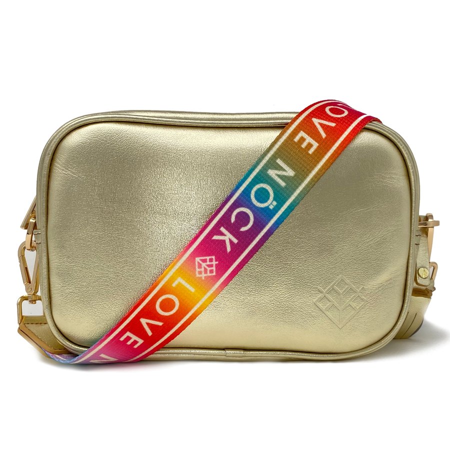
NÖCK started in 2011 making one-off bags from recycled parts and offcuts left over from factories. Leather and textiles, made by Mexican artisans, in collections drawing on Huichol and Wayuu traditions. The product was good, and the reason behind it — artisan work, a human mission, a founder's obsession with the textiles of Chiapas — was genuinely strong.
What it didn't have was a brand carrying either. Our own audit was blunt about it: the logo, the icon and the graphics had nothing to do with the artisanal roots of the product, and the whole thing read as a market stall rather than a house. A brand with real promise in design and product quality, and a positive, human message behind it, that had not managed to reach the person buying.
The Ambition
Take NÖCK into national and international competition, expressing Mexican craft and culture in a contemporary, conscious register — and build a system able to live across products, campaigns, markets and years rather than a logo that would need replacing.
The Response
Insight
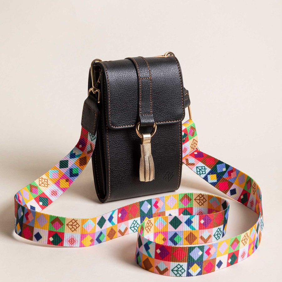
The culture was already in the product, and it was already a language. Prehispanic textiles are not decoration — they are pictograms. Religious motifs, agricultural ones, celebrations; symbols a culture can read the way you read a word. The brand had been drawn from somewhere else entirely, so the answer was not to invent a graphic world but to take it from where the product had always taken it.
Idea
Artisan heritage in your hands. Mexico goes with you. Four pillars carry it — origin, see further, human nature, singular — the last of which is literal: no two pieces are identical, because they are made by hand.
System
A symbol and wordmark built from textile geometry; a Pantone and CMYK palette wide enough to absorb seasonal collections without losing coherence; and a pattern system derived from the pictograms themselves. Then applied — packaging, campaigns, web, product design, and the photography around it.
Campaigns
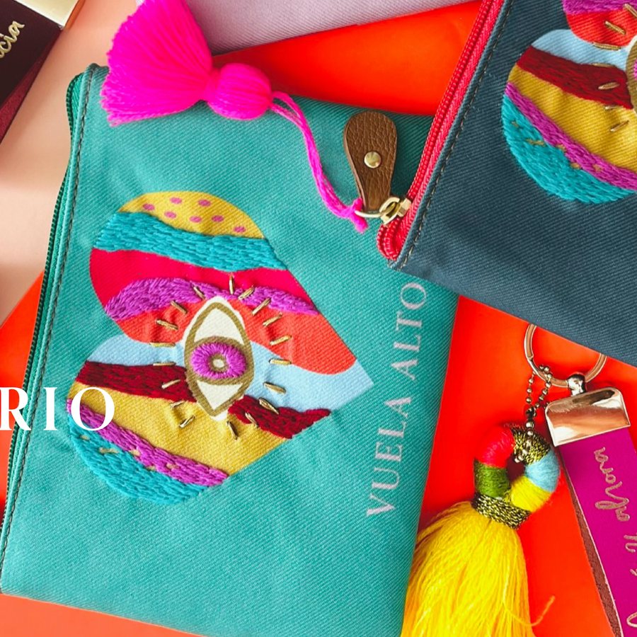
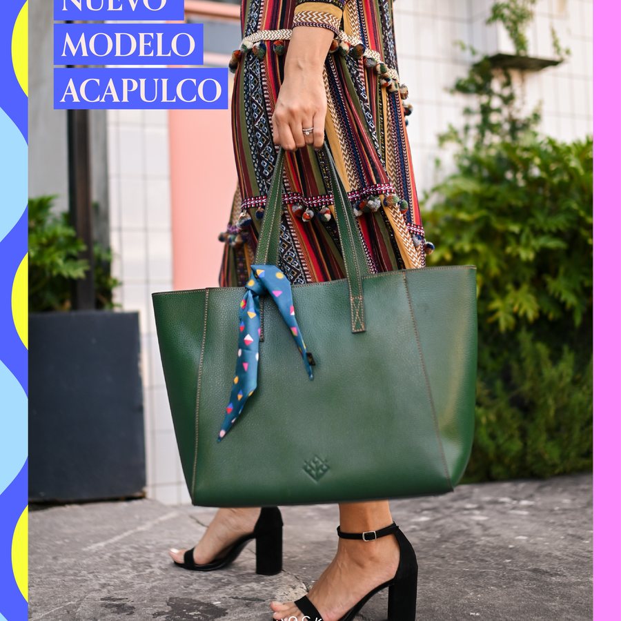
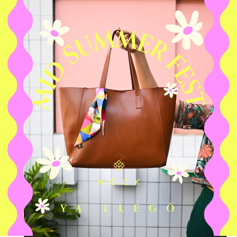
The same system, season after season.
2026 — the current chapter
Eight years in, the problem changed.
A brand this established stops having a product problem and starts having a structure problem. The 2026 Brand DNA is about the second one: not how to grow, but how to grow with structure.
| Atelier | Motion | Accessories | |
|---|---|---|---|
| Role | Elevate the brand | Scale volume | Activate the system |
| Price | High | Mid, accessible | Low to mid |
| Volume | Low | High | Very high |
| Margin | High | Mid | High |
| Risk | Low, controlled | High, exploratory | Low |
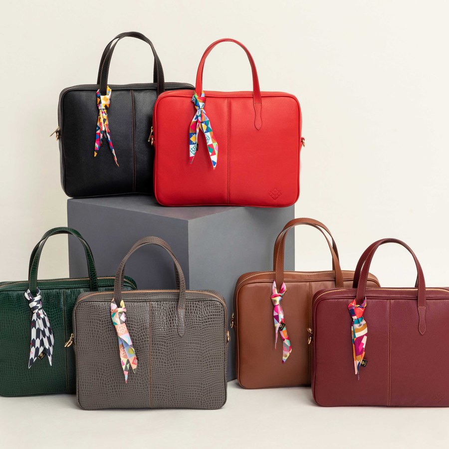
Three lines, one brand — layers of a single system rather than sub-brands.
The structure
The diagnosis was that success had produced dispersion: too many products carrying no defined role, development reacting to demand rather than directing it, and a catalogue growing faster than the logic holding it together. Nothing there is a design problem. It is what happens to a brand that wins.
The answer was one brand, not sub-brands — three lines operating as layers of a single system. Atelier carries aspiration and margin. Motion carries volume and doubles as the experimentation lab. Accessories — straps, charms — carries recurrence, and is the piece that turns a single purchase into a relationship: you buy the bag once, then keep changing it.
Which reframes what the brand sells. Not bags. Adaptable personal expression — a system designed to change with the person using it.
The Impact
The clearest evidence here is time. The strategy was written in 2018 and the relationship has run continuously since — campaigns through 2021, 2022, 2023, 2024 and 2025, a completed extension into the US market, and product design continuing into 2026.
A brand system that has absorbed eight years of new collections, new categories and new markets without being redrawn is doing the job it was built for.
And the work has changed shape with the business. What began as identity for a young brand is now brand architecture for an established one — a defined three-line structure and a twelve-month roadmap for putting it in place. That is the argument for staying with a brand: eight years on, you are solving a problem the first brief could not have anticipated.
A system you don't have to replace is worth more than a logo you love.
What this project proves