Casa Cacho
Creating a private residential identity with a sense of place.
Not a hotel. A house — with a name, and a reason to have one.
The Challenge
Casa Cacho is a private residence, not a commercial property — and that changes the brief entirely. There is no booking funnel, no occupancy target, no audience to convert. The identity exists for the house itself and the people who use it.
Which makes the usual justifications unavailable. It has to be right rather than effective.
The Ambition
An ownable identity and a physical expression for the residence, with enough system behind it to apply consistently across the objects a house actually accumulates.
The Response
Insight. A house is named the way a person is: once, permanently, and with the expectation it will outlast every fashion around it. That rules out most of what a brand identity would normally reach for.
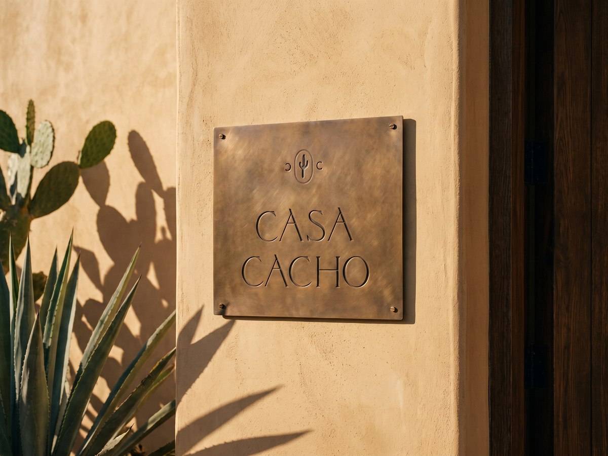
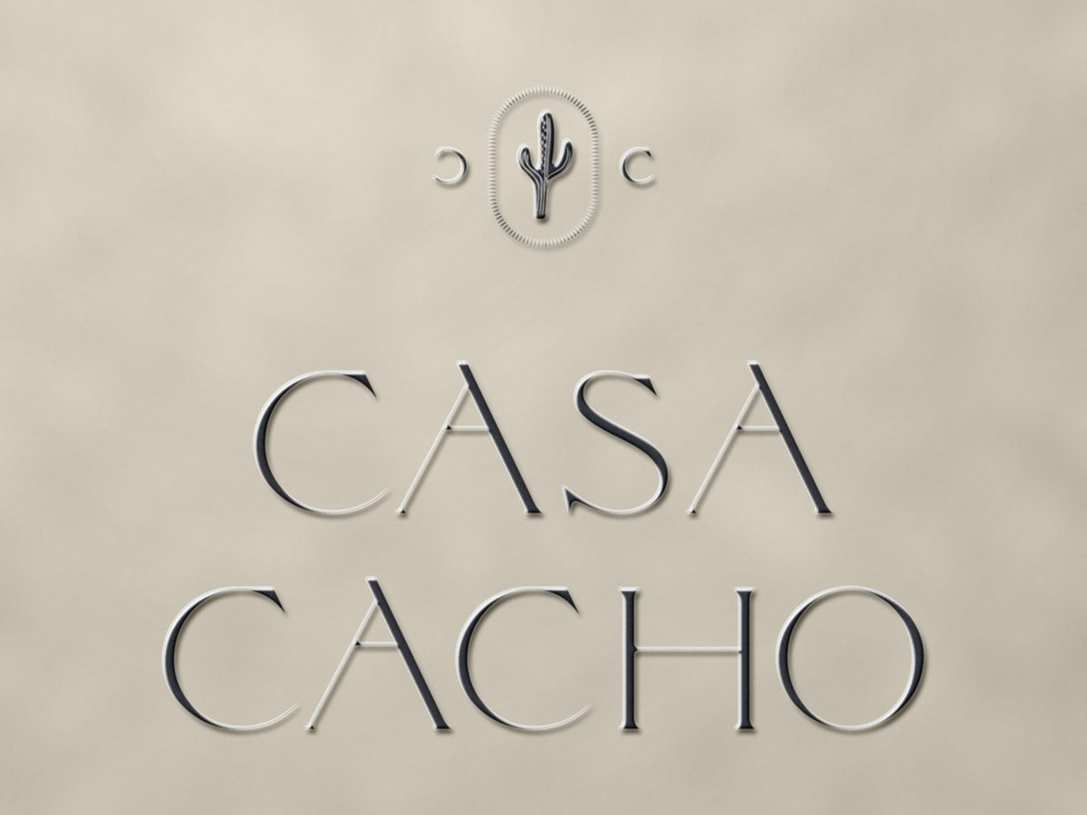
Idea. A quiet typographic wordmark with a small mark above it, built to survive being embroidered, embossed, printed one colour or burned into wood.
System. The mark across a palette of house colours — terracotta, green, mustard, off-white, wine — plus physical applications including embroidered pieces made from the same artwork.
The Impact
A delivered identity that behaves like part of the architecture rather than a layer applied on top of it.
Named once, and built to outlast the fashion around it.
What this project proves