SHAY Jewelry
Evolving heritage into a contemporary luxury experience.
At this altitude nothing needs to be made to look expensive. The risk runs the other way.
The Challenge
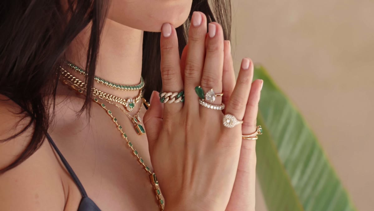
SHAY is a Los Angeles house built by a mother and daughter, working in 18k gold and precious stones, with Persian heritage running through the design language. Its pieces are worn at the level where they end up in the editorial pages of Vogue, the New York Times, Elle, W and Variety — and the house has been operating at that altitude for years.
A brand there does not need to be made to look expensive; it already is. The risk in a project like this runs the other way. "Refresh" is where houses quietly lose the thing that made them particular — where heritage gets traded for a cleaner logo, and a family story becomes a typeface. The work had to move the brand forward without spending what it had already accumulated.
The Ambition
A brand experience capable of carrying craftsmanship, modernity, tactility and value at the same time — something a client registers in the hand, not only on a screen.
The Response
Insight
In fine jewellery the product is the one thing already beyond reproach. What tends to be uneven is everything around it — the box, the card, the weight of the paper, the way a piece is lit and shot. That surrounding experience is where a house either earns its price or quietly argues against it.
Idea
Three strategic territories were developed and one was taken forward, built on the brand's own vocabulary: timeless, tactile, contrast, natural, sculptural. Heritage and modernity held in tension rather than resolved in favour of either — which is also, precisely, the relationship between the two women who founded it.
System
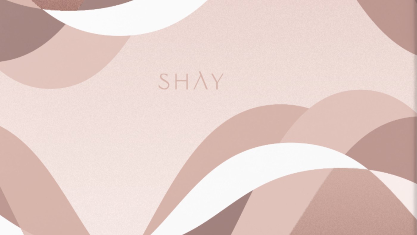
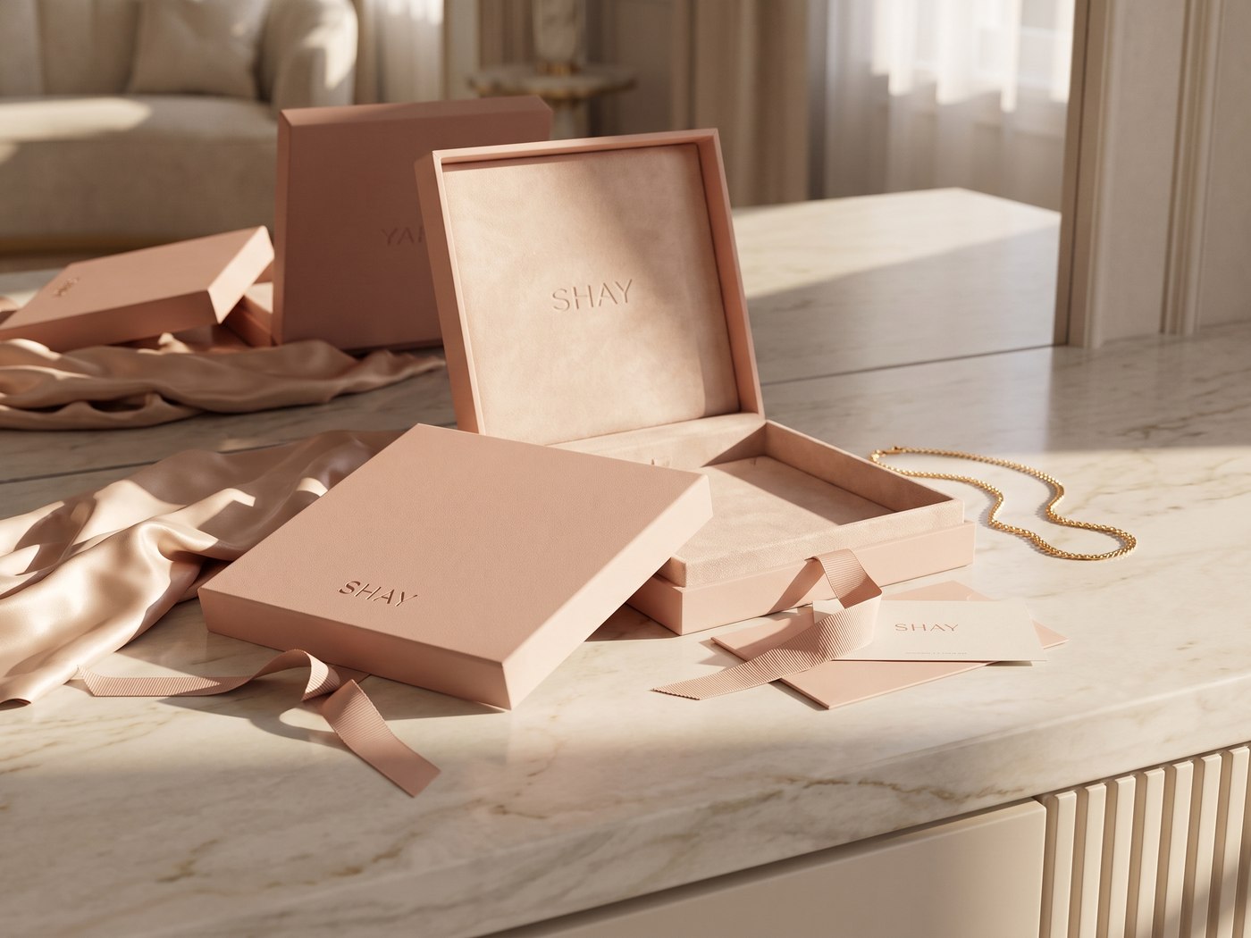
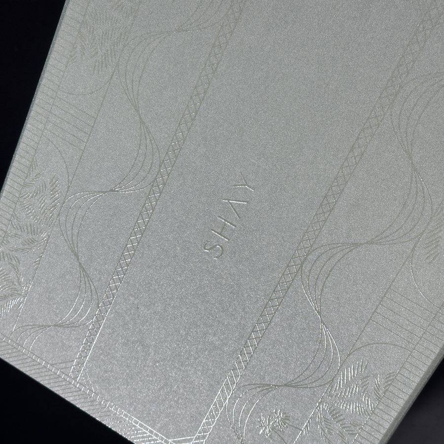
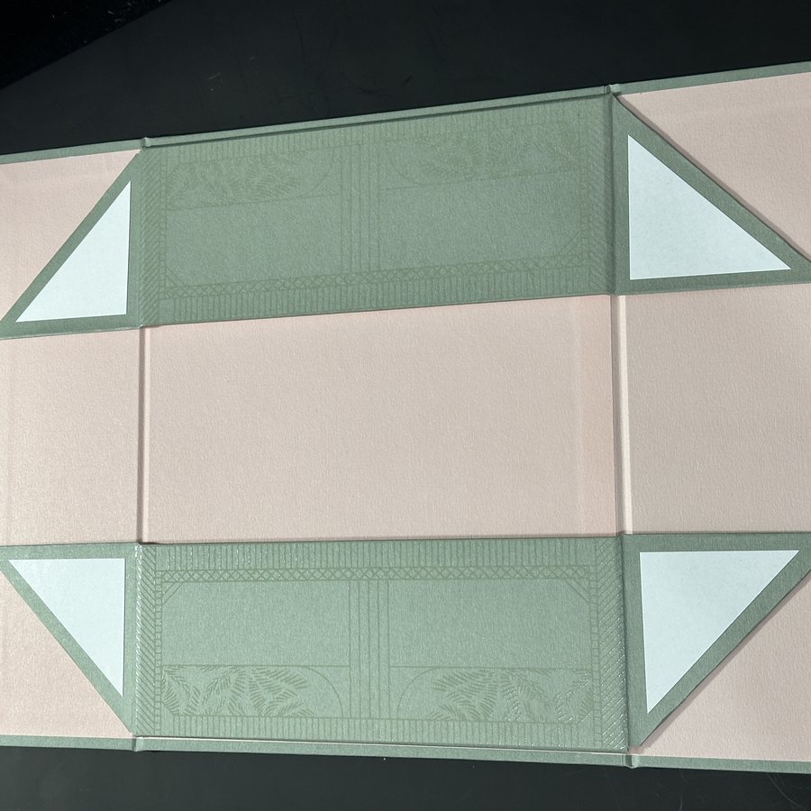
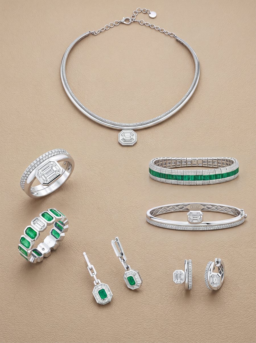
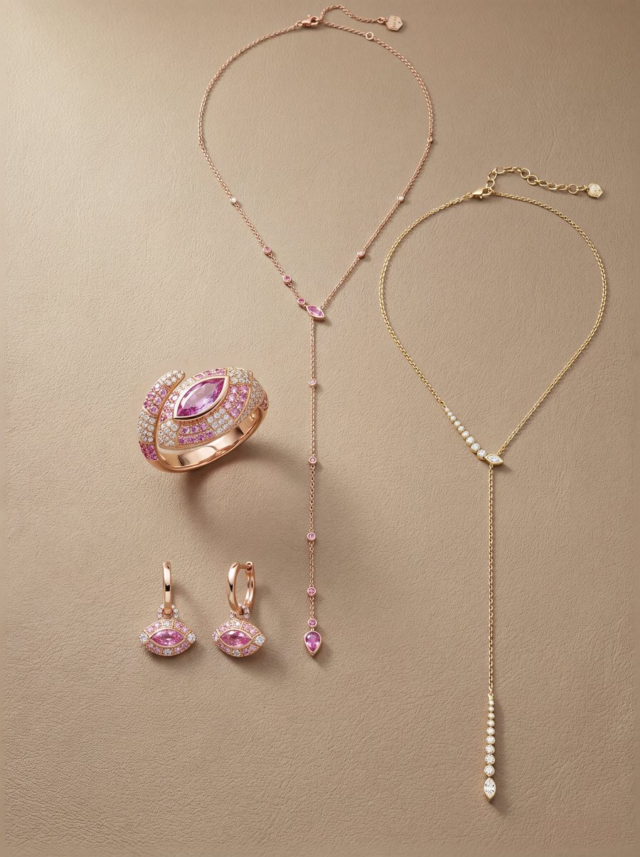
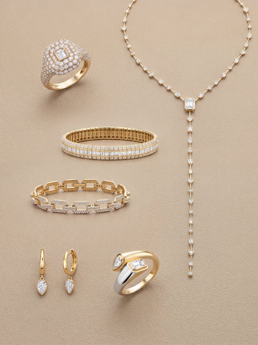
A full rebrand rather than a refresh: the identity and its applications, a colour system of primary and secondary palettes, and a packaging programme carried past render into physical production samples — including the pieces a client actually handles, the care guide, the certificate, the welcome card. Then an editorial product book covering six collections, with real product photography composited into flat-lays on a warm sand plate, and film to give the pieces movement.
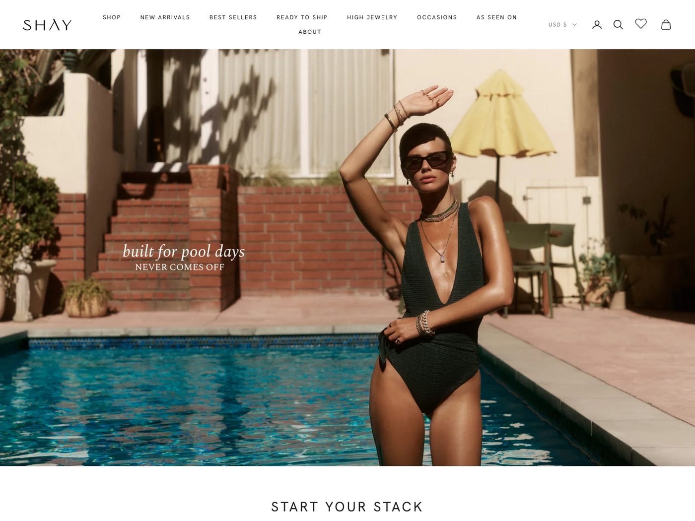
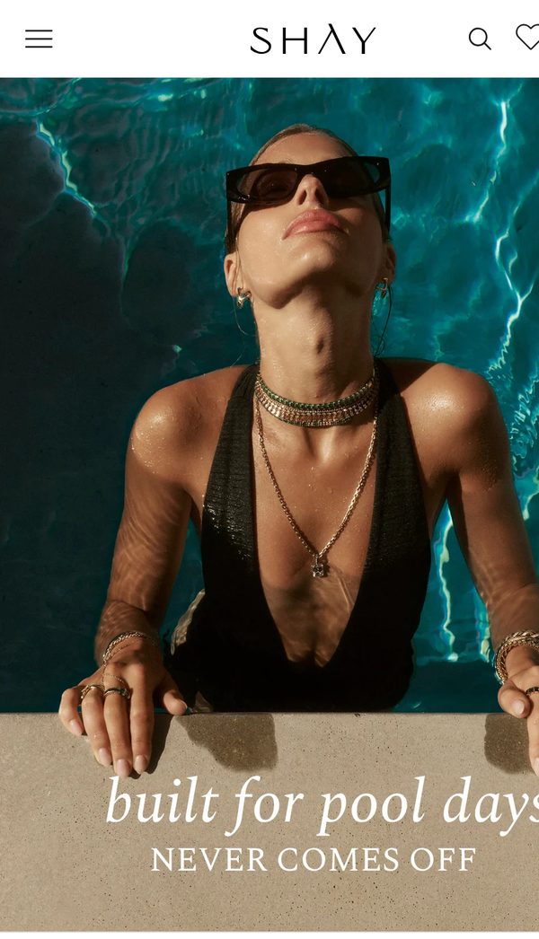
The same system was carried into the storefront: the site redesigned on Shopify, a new product-page template, and the product copy rewritten across the catalogue so the language on a product page matches the language on the box.
The colour system, in use
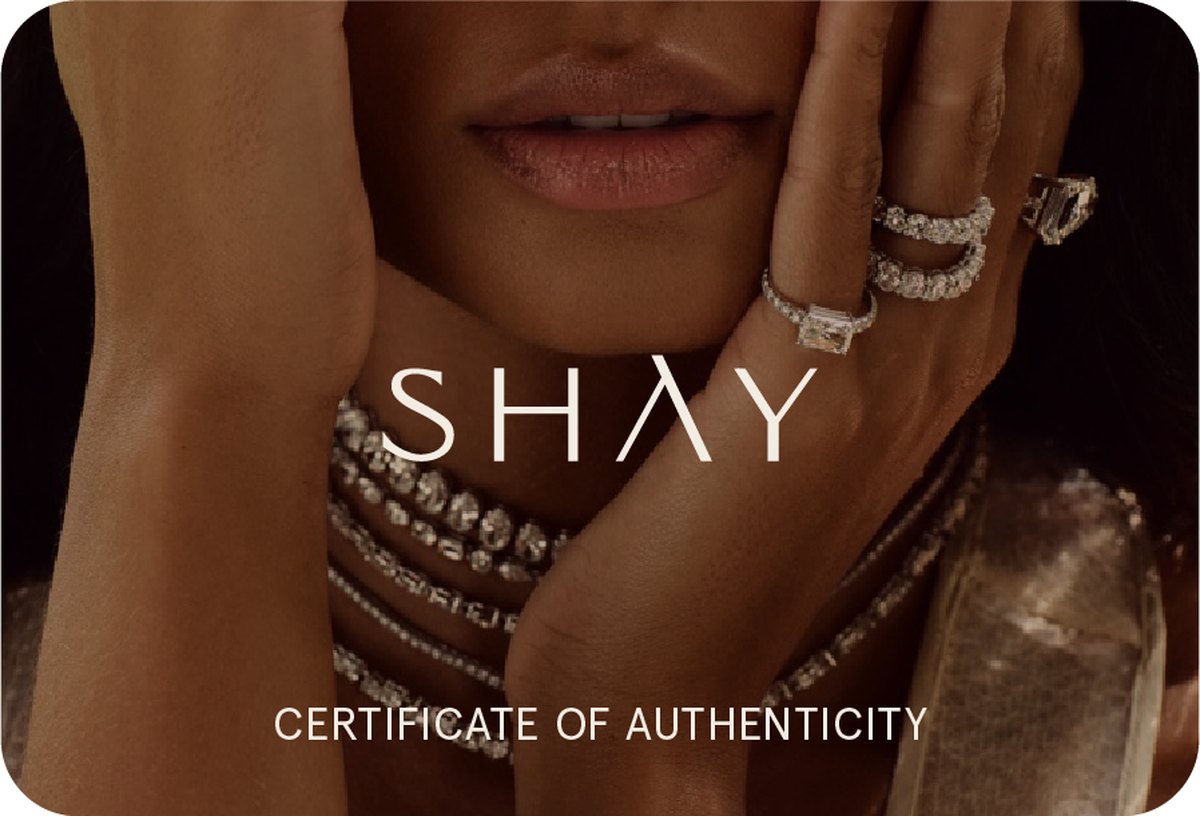
Packaging, in production
Judged in the hand, not on a screen.
The storefront
The same brand, all the way to checkout.
A redesigned Shopify storefront, a rebuilt product-page template, and product copy rewritten across the catalogue — so the voice a client meets on a product page is the voice inside the box.
The product book
Six collections, one plate.
Every piece photographed against the same warm ground, so a collection reads as a collection rather than a page of separate objects.
The Impact
Delivered end to end: the rebranded identity and its colour system; a packaging programme that reached physical production samples rather than stopping at render, inserts included; an editorial product book spanning six collections; film; and a redesigned Shopify storefront with a new product-page template and rewritten catalogue copy.
The house now has one brand experience running from the first product page a client sees to the box that arrives at their door — which is the point at which a jewellery brand is actually judged.
The product was never the problem. Everything around it was the opportunity.
What this project proves